A release gate for AI features. I designed the review that finds the conversations an average hides, from the run that splits a score by category to the rollback a policy owner can make from a phone.
- Role
- Product design, end to end (solo)
- Year
- 2026
- Platform
- Web and iOS
- Domain
- AI evaluation · Release management
- Delivered
- Flow, identity, screens mapped and designed, recorded motion
- Stack
- Figma, FigJam, React Aria
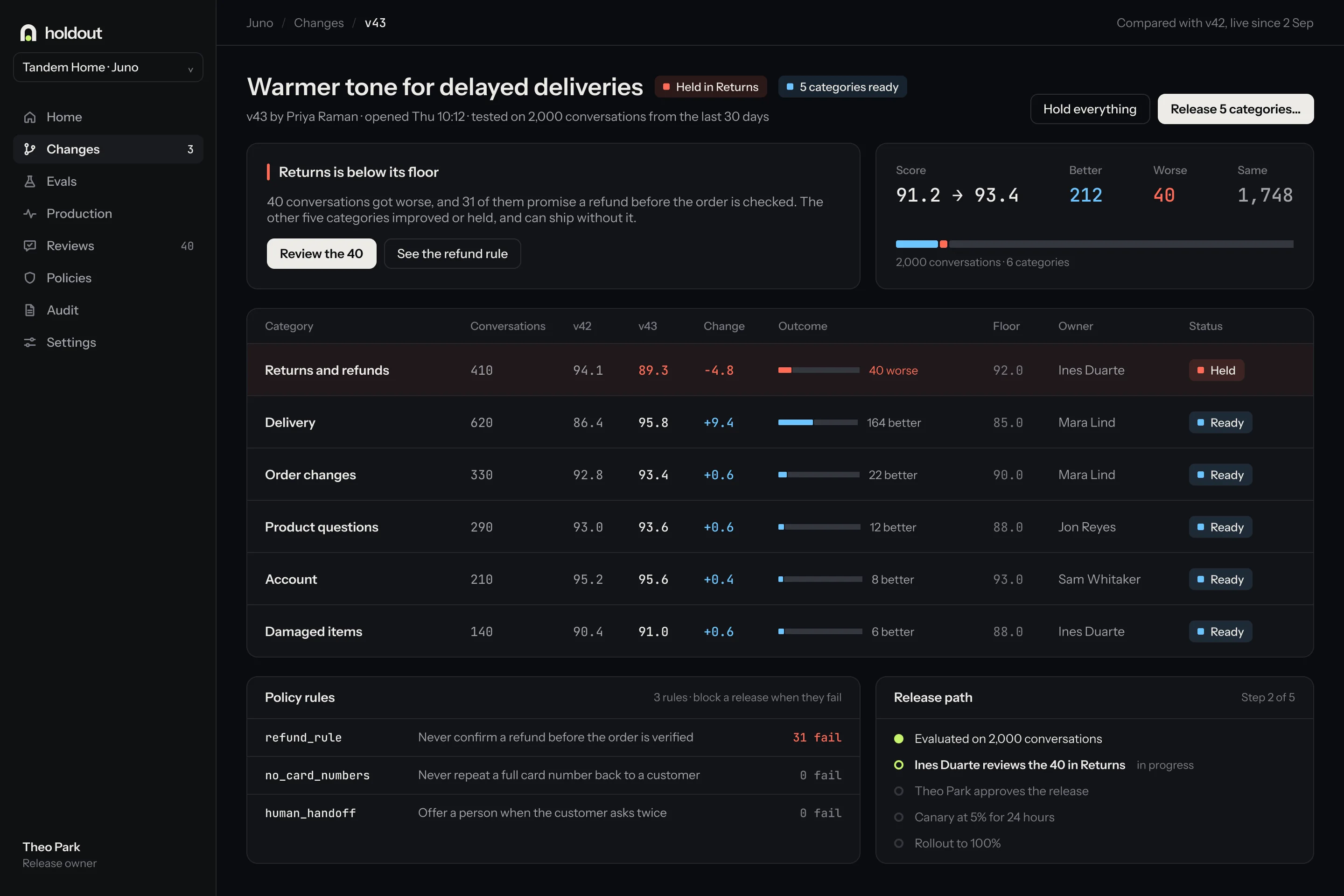
A team ships a prompt change and scores it against the version it replaces. Version 43 scored 93.4 where version 42 scored 91.2, so it shipped. The average had gone up.
Underneath it, forty refund conversations had got worse, and the person who owns the refund policy never saw them. Holdout is the product I designed to catch that: it splits the score by category, puts the changed conversations in front of the people who own them, and releases by category instead of all at once.
The run, split by category
Two thousand conversations scored on both versions. The overall number goes up and the category breakdown shows the one that went the other way.
An average is a summary. A release is a decision, and the two are not the same thing.
Evaluation tooling was built to compare two numbers. It answered whether the new version is better on the whole, which is the one question a release does not turn on.
The work that mattered was spread across four tools and nine steps, and the person with the domain knowledge to judge a refund answer was at the end of a chain rather than inside the product.
- 01
A better score can hide a worse category
Gains in five categories covered a regression in the sixth, and nothing in the workflow made the sixth visible.
- 02
Nobody reads two thousand conversations
Reviewers sampled at random, which finds the typical case and reliably misses the one that changed.
- 03
The person who could judge it was not in the loop
The refund policy owner had the context to call the regression and no route into the release that produced it.
Release by category
Five categories go to five per cent, refunds stay on version 42, and a canary is watched for a day. One change, two versions, both legible.
Walk the four days as they really happened.
I owned the product end to end: the flow, the identity, the screens across web and iOS, the design system on React Aria, and the recorded motion.
- 01
Split the score by category, which is the decision every other part of the product follows from.
- 02
Designed the review around what changed rather than a random sample, so a person reads forty conversations instead of two thousand.
- 03
Routed the domain owner in automatically, and made separation of duties a role rather than a setting.
- 04
Designed release by category and a rollback a policy owner can make from a phone, because the decision does not always happen at a desk.
Map the failure before the product
I laid the four days out as swimlanes, with a pin wherever a regression slipped through. Every pin had to be answered by a screen or the screen did not get drawn.
Find where two good requirements collided
Five of them carried the product, and none was visual: speed against scrutiny, automation against accountability, and coverage against what a person can actually read.
Make colour a verdict
Sky means better, coral means worse, and nothing else earns colour. On a screen full of comparisons, decoration is noise that costs judgment.
Record the motion from the real screens
The key moments were rebuilt from the Figma screens and recorded at 60 frames a second, so the motion and the designs can never drift apart.
The rollback that does not wait for a desk
A regression found at the wrong hour still has to be answerable. The phone carries the verdict, the evidence and the rollback, not a notification pointing at a laptop.
Four decisions did most of the work.
- 01
The score is split by category, never reported as one number
A single figure is the mechanism by which the regression hid. Splitting it costs a more complex result screen, which is the right price for a decision with customers on the other side of it.
- 02
People read what changed, not a random sample
The review queue is built from the conversations that moved, so forty get read instead of two thousand sampled. The cost: a category that did not change gets no human eyes at all.
- 03
The decision lives in the product
Shipping, holding and rolling back happen where the evidence is, rather than in a ticket that references it. The cost is a heavier product surface and a real permissions model.
- 04
Release by category, gradually
Five categories ship to five per cent while the regressed one stays on the old version and a canary is watched for twenty-four hours. The cost: two versions in production at once, which the product then has to make legible.
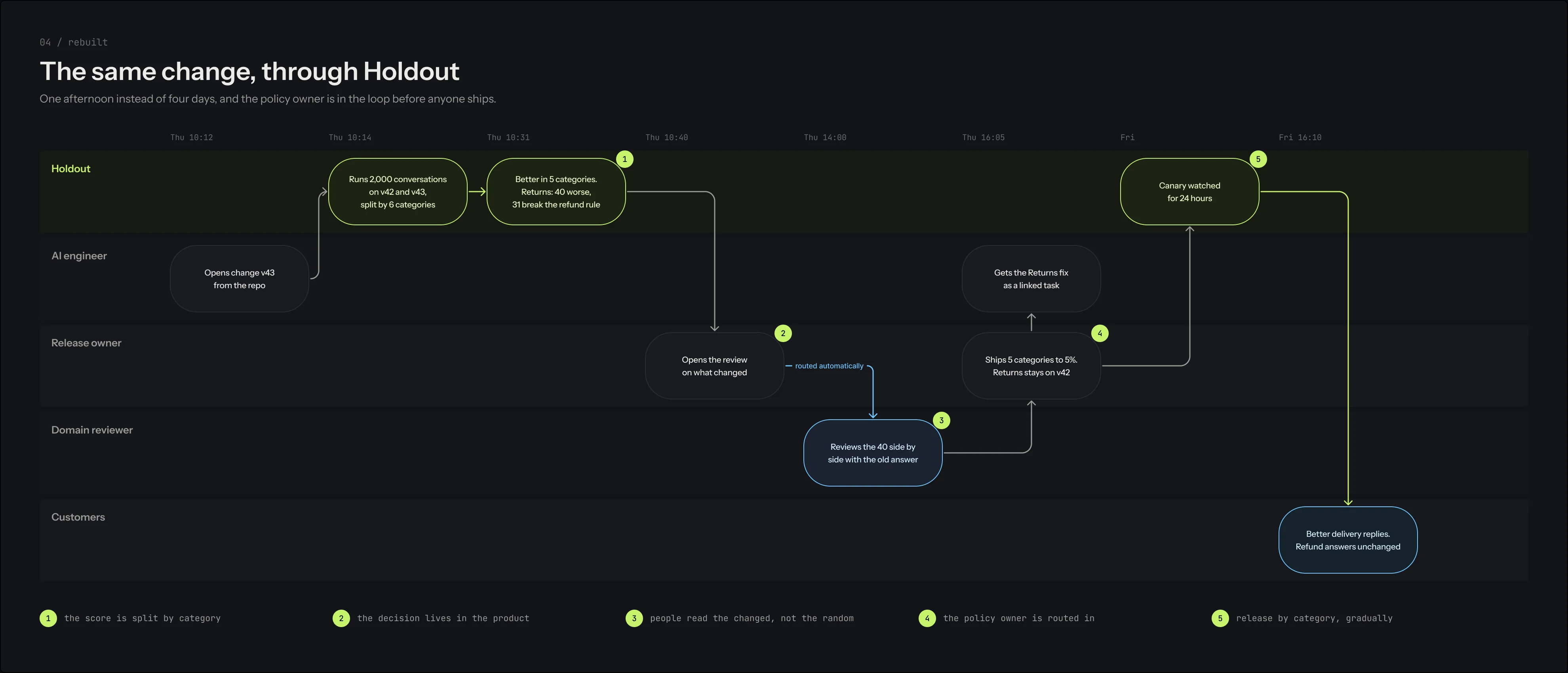
The same change, walked again
Four days become one afternoon, and every numbered pin on the original failure is answered by a step in the product. Each lane has an owner, which is what makes separation of duties real.
A release decision made where the evidence is, by the person who can judge it.
The result is one afternoon in one tool: the run splits, the changed conversations get read by their owner, and the release goes out by category with the regression held back.
It demonstrates evaluation workflows designed around judgment rather than summary statistics, a design system where colour carries a verdict, and motion recorded from the real screens.
- 2,000
- conversations behind every number on the screen
- 40
- of them a person actually reads, chosen because they changed
- 44
- screens mapped across web and mobile before a pixel was drawn
- 60
- frames a second, recorded from the real designs
If I took this further, the next step would be running it with support leads and the engineers who ship the prompts. Whether forty is a readable number under deadline, and whether category release is worth two live versions, are the two assumptions carrying the most weight.
Wake
Dispatch that shows its knock-on